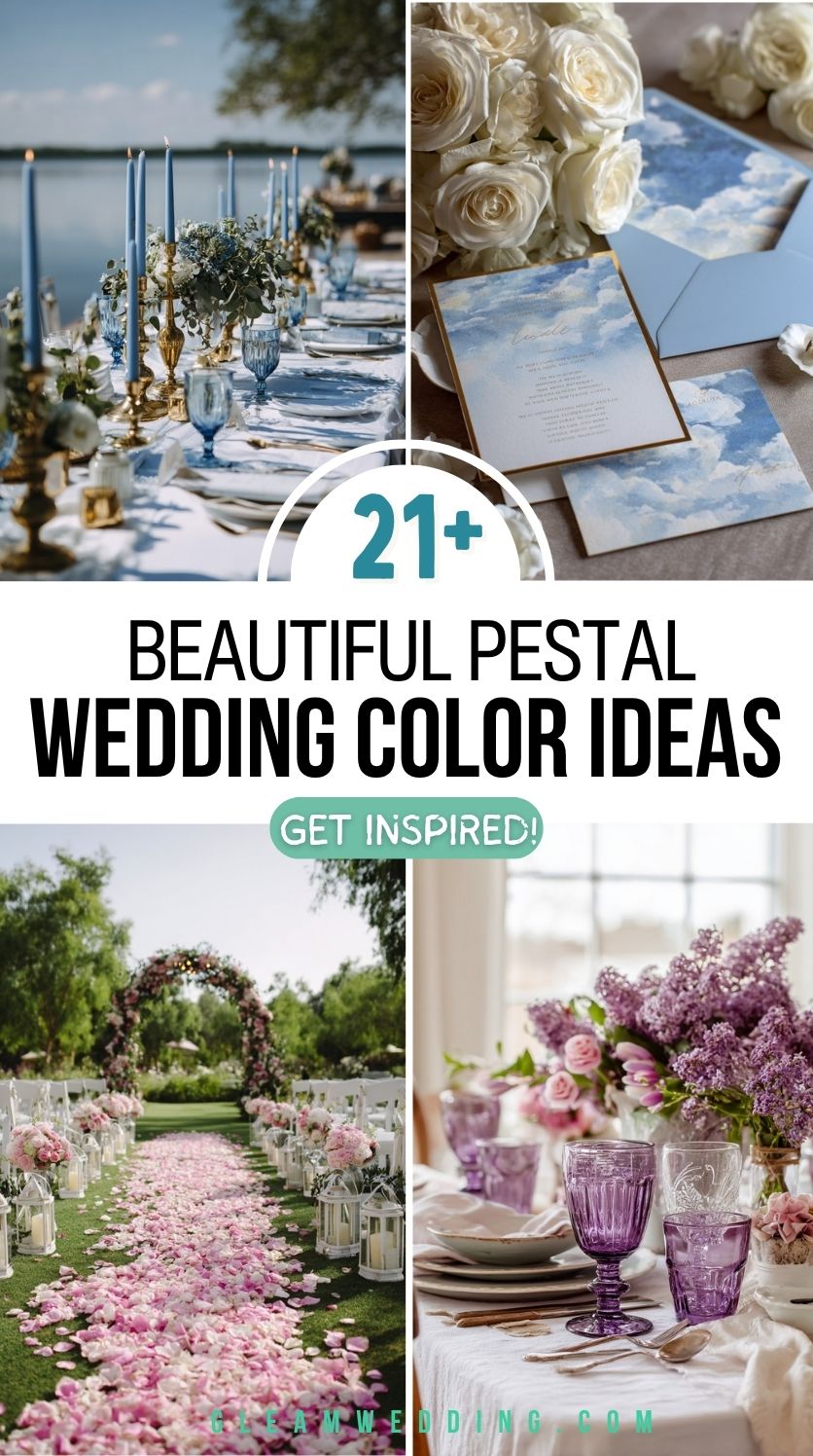
21 Pastel Wedding Color Ideas (Soft Romance Without The Overwhelm)
You pull a swatch of soft blush fabric from the sample book and hold it up to the light. It’s pretty… but is it the color? The one that feels like your love story in a shade? You flip to sage green. Then dusty blue. Then lavender. Everything’s beautiful,, but now you’re overwhelmed.
Planning a wedding means making about a thousand tiny decisions, and choosing a color palette is one of the first that actually feels real. It sets the tone, the mood, the vibe. It’s what guests will remember in photos, in flowers, in the way the day simply felt. No pressure, right?
If you’ve landed on pastels, you’re already halfway there. There’s something timeless and tender about these soft, romantic hues. They whisper elegance. They play well with nature. And they create space for emotion to shine brighter than anything else.
Still, not all pastels are created equal, and not every combo fits every couple. That’s where this comes in. Below, you’ll find 21 pastel wedding color ideas that feel fresh, dreamy, and deeply personal—so you can stop second-guessing and start seeing your day in full color.
1. Layer Roses and Crystal for Romantic Contrast
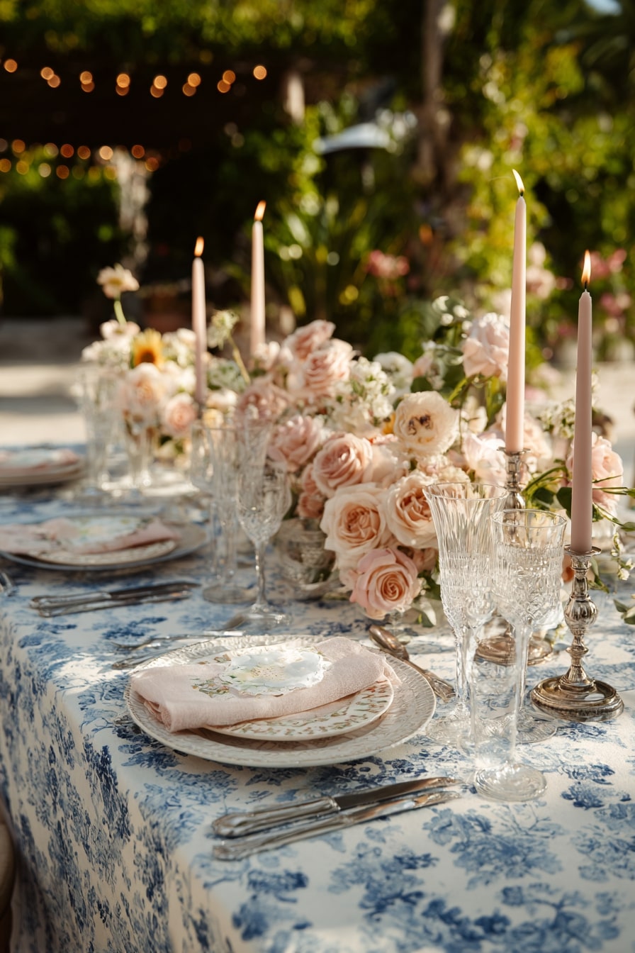
A floral runner packed with blush and ivory roses sets a lush, opulent tone. Look closer, glassware does the heavy lifting here. Cut crystal goblets and taper holders bounce light in every direction. Linen napkins in whisper-pink echo the florals without overwhelming the patterned toile.
The magic? It’s the texture mix. Soft blooms. Hard crystal. Patterned fabric. Harmonious, yet full of contrast.
2. Pair Blush Stationery with Soft Script for Elegant Warmth
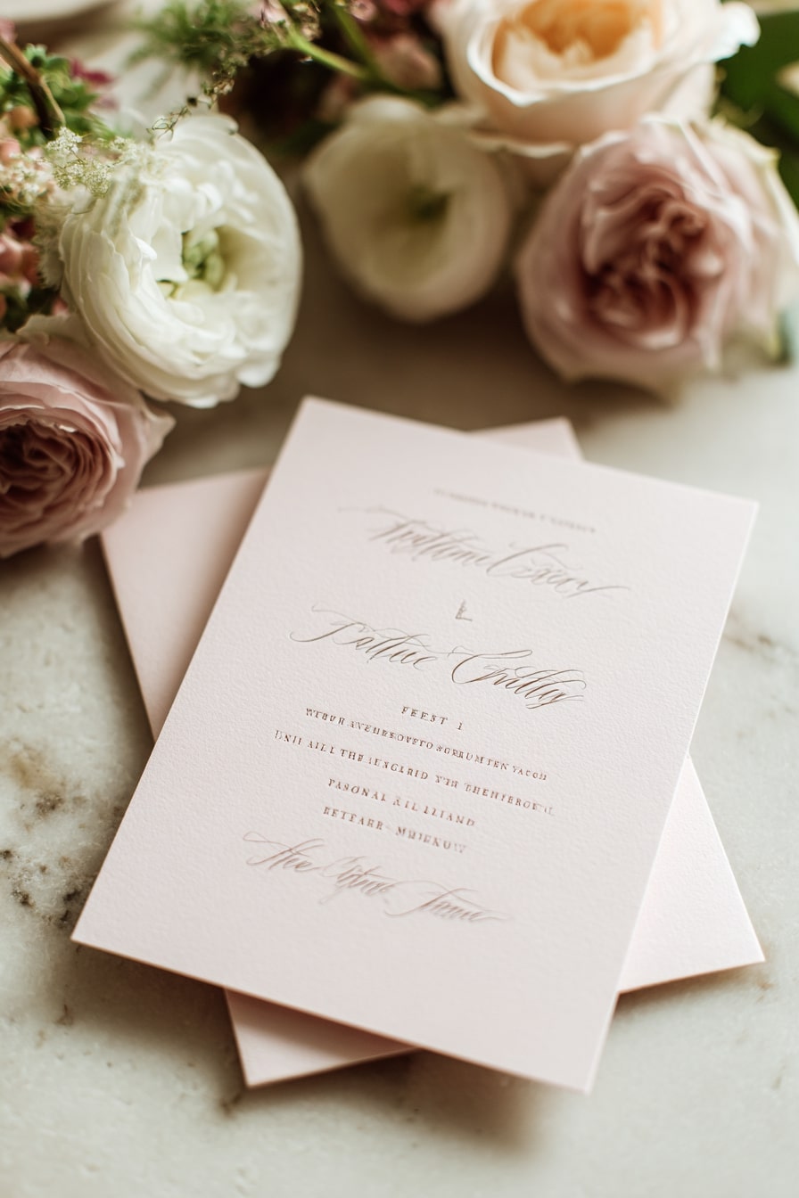
No gloss. No gold. Just soft blush paper with letterpress script that almost whispers. That’s the point. It pulls you in close. The handwritten typeface gives a gentle intimacy, while the muted mauve ink keeps things grounded, not sugary.
Add in garden roses, ranunculus, barely open, you get texture without clutter. Romantic, but restrained. Quiet luxury in paper form.
3. Accent Citrus Drinks with Wildflower Touches
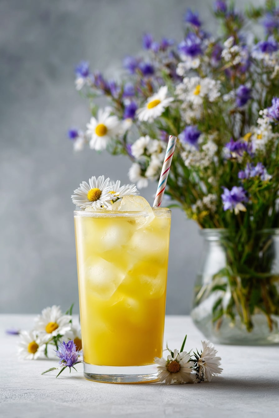
Bright yellow. It’s bold, but softened here by daisies and cornflowers. The icy citrus drink pops against a soft gray backdrop, while scattered florals add a handpicked charm. It feels unstyled, which is the genius.
That paper straw? A quiet callback to vintage picnics. Together, it leans rustic but polished. Just enough whimsy to keep a pastel palette from feeling flat.
4. Use Glass Butterflies for Whimsical Shine
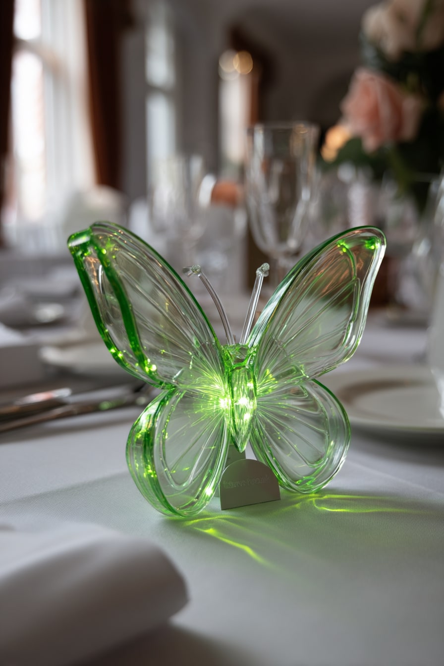
Light catches it, then scatters. This translucent green butterfly works like a mini prism, pulling ambient light across a white tablecloth. Not just décor, it anchors the pastel palette with something unexpected.
Shape matters here. Curves feel gentle, never rigid. That playful glow shifts tone hour to hour. Afternoon shimmer, evening sparkle. A single object, doing quiet work.
5. Contrast Navy Suits with Blush Details for Subtle Drama
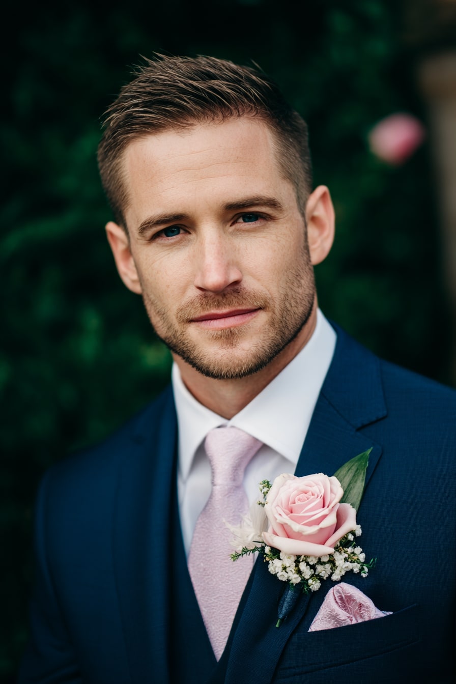
Strong contrast. Soft payoff. A deep navy suit lays the base, letting blush accents carry all the warmth. That satin tie, pale but not washed out, picks up the rose boutonniere without feeling too matchy.
Texture layering does the trick. Silk, velvet, fresh petals. Cool and warm tones playing off each other. Clean lines meet soft color, and it just works.
6. Mix Textured Blooms for Dimensional Pastels
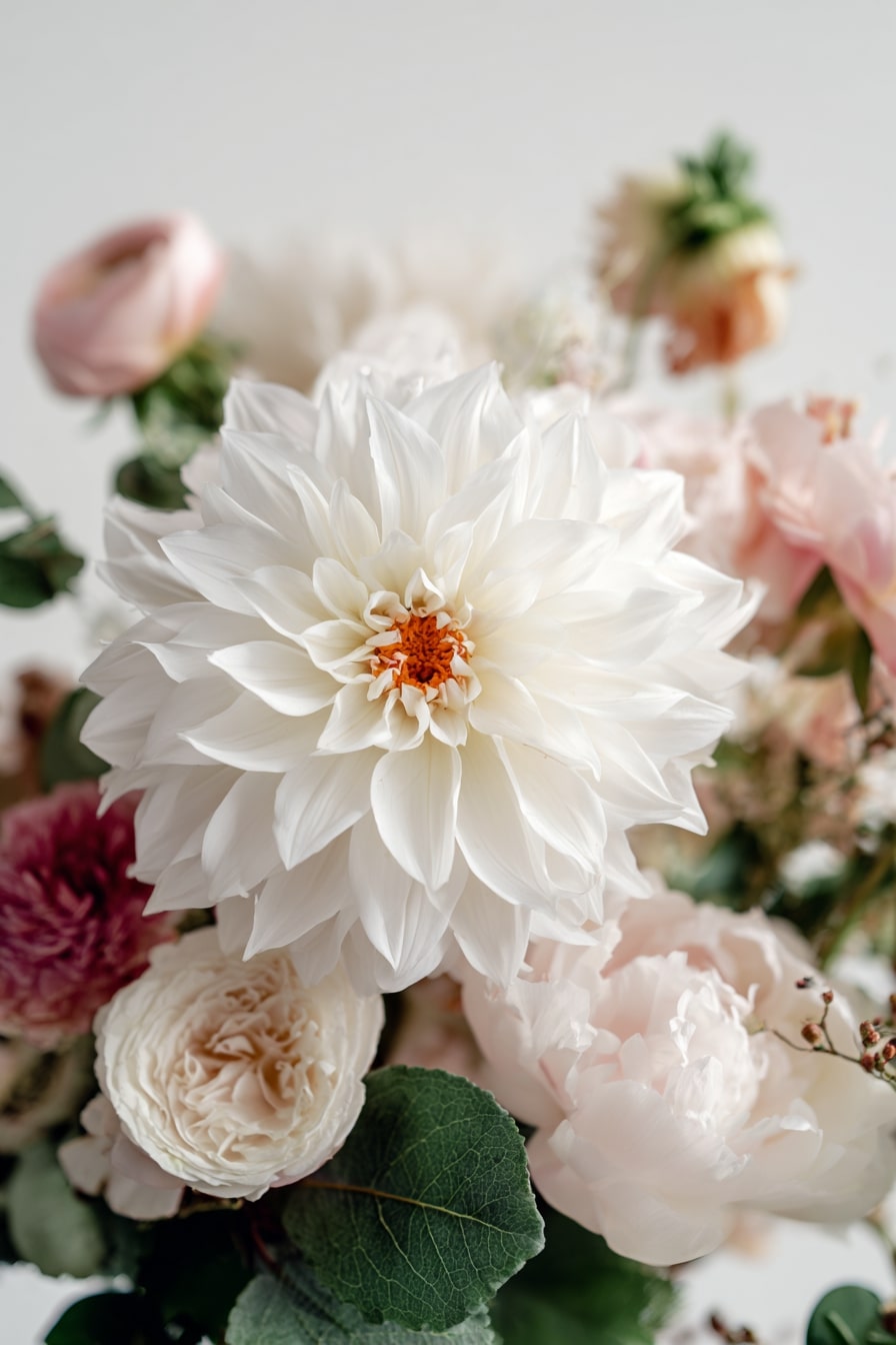
Soft isn’t boring. This bouquet proves it. One giant white dahlia grabs attention first, but look again, and layers unfold. Blush peonies, ruffled ranunculus, dusty roses, all in muted tones, but with wildly different petal shapes and sizes.
That contrast matters. Texture builds depth. Subtle shades read stronger when they don’t all blur. Pastel, but sculptural. Romantic, yet bold.
7. Pair Mint Table Linens with Gold Flatware for Polished Softness
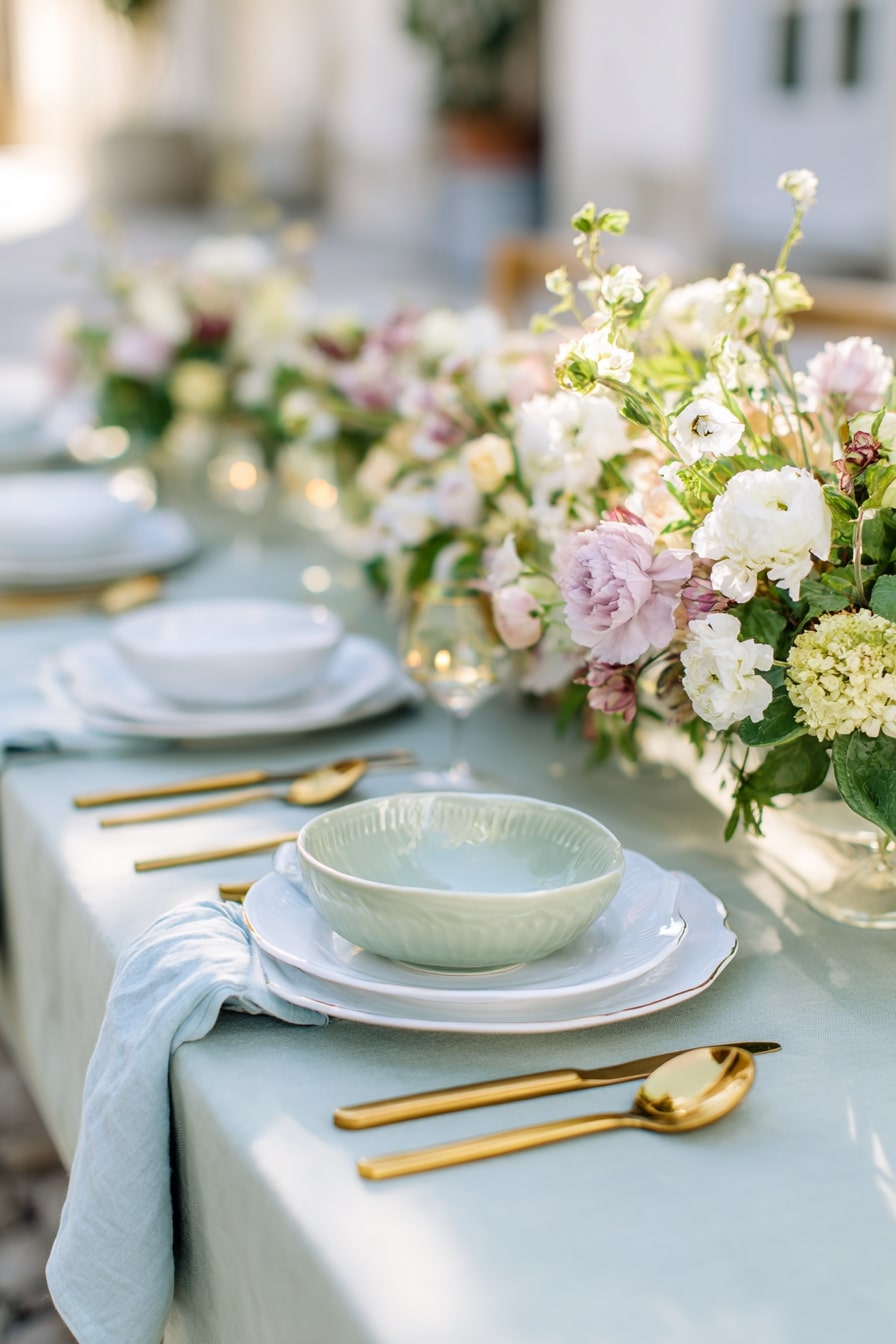
Cool base, warm accent. The pale mint tablecloth sets a quiet tone, but doesn’t fade. Gold flatware punches through, sleek and structured. That contrast keeps it elevated, not sleepy.
Plates stay simple. Matte ceramic, no shine. Even the napkin drapes loose, not folded. It’s softness with intent. Pastels feel crisp here, thanks to clean shapes and intentional metallics. Light, not lazy.
8. Layer Wild Pastels for a Garden Feast Look
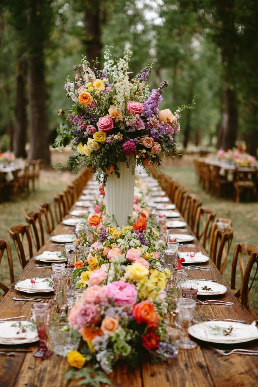
This isn’t shy. It’s bold pastel, stacked and sprawling. Ranunculus, roses, snapdragons, lisianthus, all tumbling down a raw wood table, echoing the forest around it. That mix of high and low, formal floral shapes with wild volume, creates movement.
Palette matters. Butter yellow, lilac, coral, blush. Not a single true primary. It stays soft, but never fades. Lush, loose, alive.
9. Match Blush Accessories with Layered Bridesmaid Tones
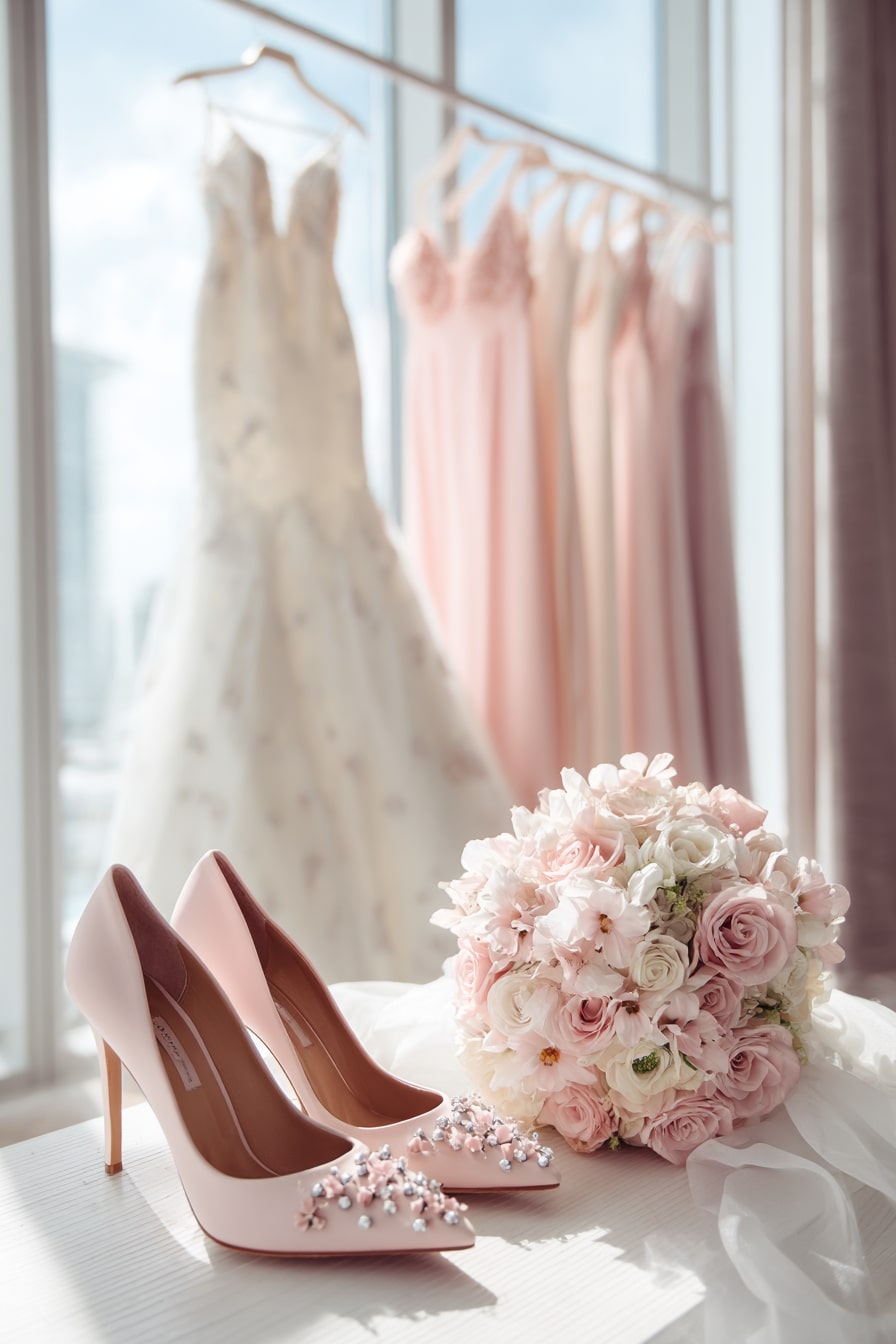
Color harmony starts early. Soft blush heels mirror every pink in the frame — the bouquet, the dresses, even the floral appliqué on the gown. It’s deliberate echoing, not duplication.
Layering matters here. Bridesmaid gowns shift from rose to shell to ballet pink, adding tonal depth. No two shades fight. Every piece blends, then glows under natural light. Feminine, focused, refined.
10. Anchor Lounge Spaces with Blush Velvet and Greenery
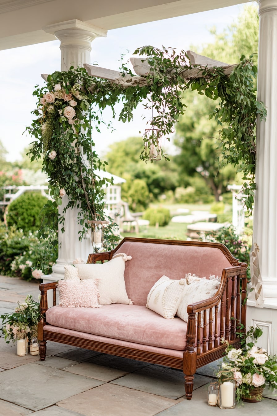
Start with texture. That velvet settee, dusty rose with warm wood arms, grounds everything. It feels vintage, but not stuffy. Draped greenery above softens the frame, while cream blooms echo the seat below.
Spacing works too. Open patio, columns spaced wide, lets florals breathe. Pastels stay visible, not lost. It’s both a photo op and a pause point. Lush but light.
11. Swap Classic Black Tie for a Blush Statement Jacket
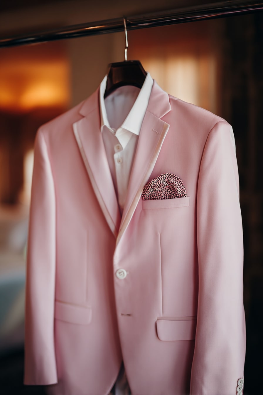
Color leads here. The soft pink jacket does all the talking. No boutonnière, no tie, no fuss. Just tone and texture. The crisp white shirt keeps contrast clean, while the dotted pocket square brings polish without trying too hard.
Cut is slim, modern. Satin-trimmed lapel adds a formal nod. Pastels, when tailored this well, feel confident, not costume. Subtle, but strong.
12. Pair Dusty Blue Florals with Lace for Vintage Charm
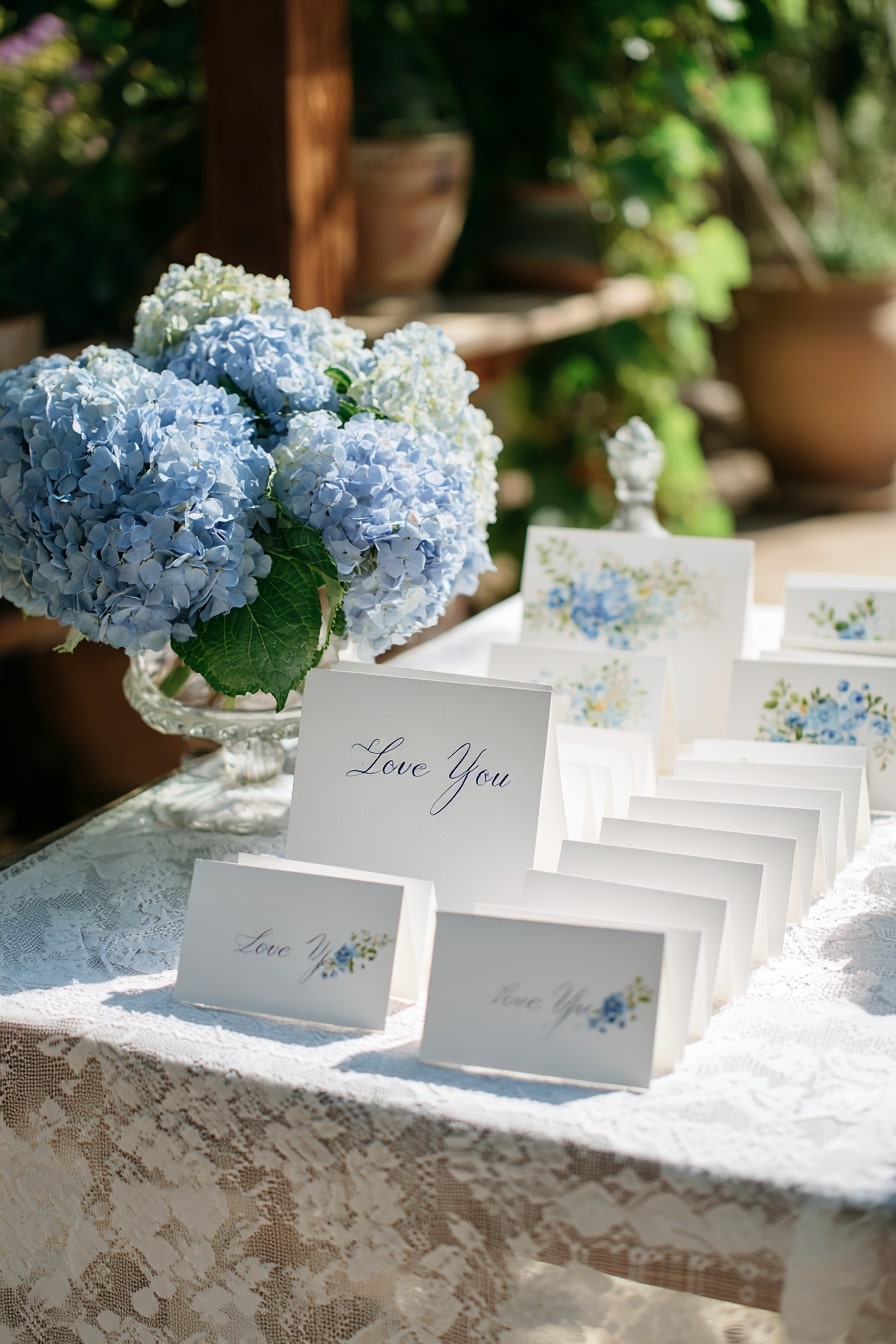
Soft blue hydrangeas do the heavy lifting here. Paired with white lace, they lean traditional, but fresh. The paper suite mirrors the palette, using hand-painted florals and loose calligraphy to echo that garden feel.
Nothing feels mass-produced. The repetition of “Love You” reads intentional, not cheesy. It’s quiet romance layered with texture, tone, and just a hint of nostalgia. Light, airy, lasting.
13. Shape a Floral Arch with Layered Pastel Blooms
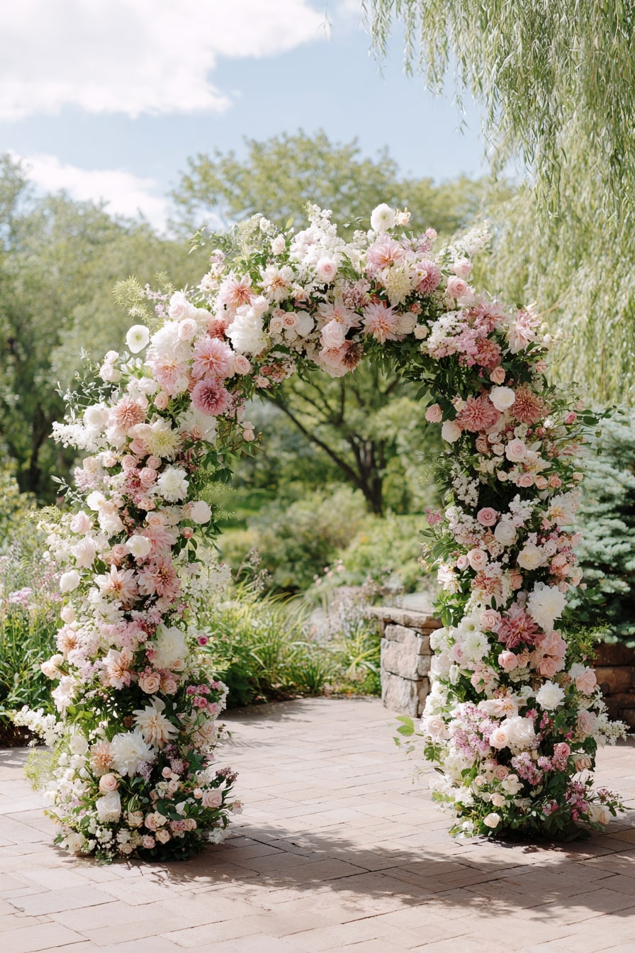
Scale makes this sing. A full arch, built with blush dahlias, cream garden roses, and fluttery lisianthus, pulls the eye upward. Nothing flat. Florals wrap in and out, with intentional gaps that let light through.
Color stays close. Rose, ivory, dusty mauve. All soft, but never dull. Texture carries it. Round heads, feathery greens, clustered buds. Romantic structure, loose edge. Balanced, never rigid.
14. Tuck Lavender Illustrations into Rustic Escort Cards
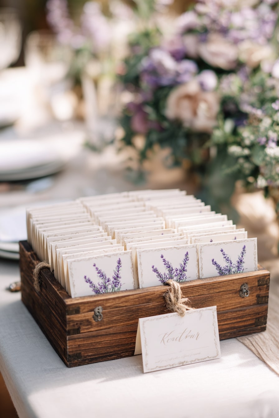
It’s soft, but grounded. Watercolor lavender blooms add calm energy, while the rough twine and weathered wood box hold it all down. That contrast matters. Too much pastel, it floats. Add grain, it lands.
Cards line up clean, but never feel stiff. Hand-drawn details, torn-edge paper, soft script. Every part whispers cottage garden, not stationery suite. Pretty, yes. But personal too.
15. Offset Cornflower Blue with Brass for Elegant Coolth
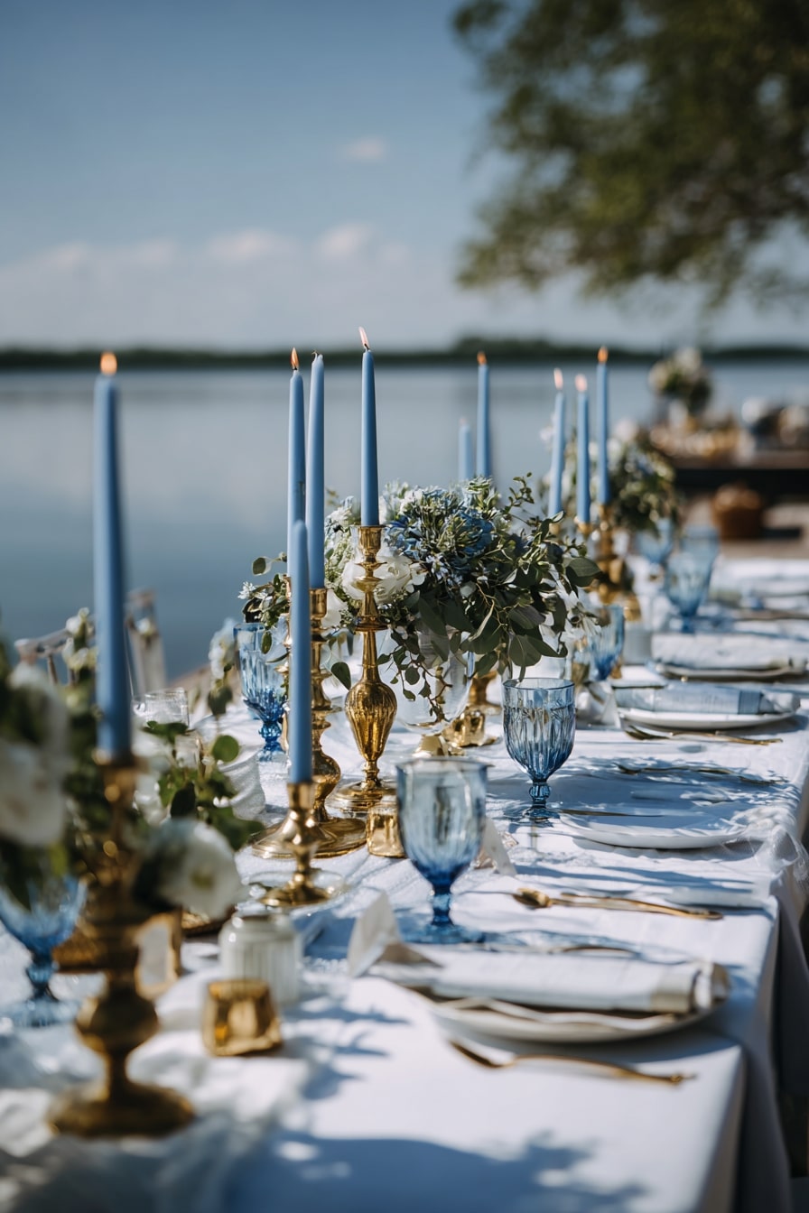
Blue on blue, but never cold. Tapered cornflower candles echo the lake beyond, while brass candlesticks add grounded warmth. That balance keeps things luxe, not icy.
Pressed goblets and pale linen keep tone light. Even the florals hold back, leaning eucalyptus-silver with scattered blue hydrangea. No pink, no peach. Just quiet blues and metallics, layered with restraint. Coastal, but crisp.
16. Use Sky-Inspired Stationery for Dreamlike Impact
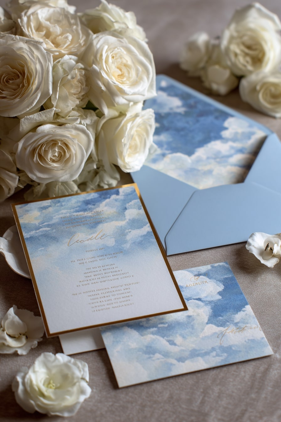
It floats. Literally. Watercolor clouds drift across each piece, soft blues fading to cream. Paired with ivory roses, the palette feels airy, but grounded by that subtle gold edge. Just enough structure.
Envelope liner matches sky tone exactly. That matters. Total cohesion. It’s not just color, it’s mood. Pastels don’t whisper here, they expand. Like open air, held in your hands.
17. Line an Aisle with Petals and Lanterns for Fairytale Flow
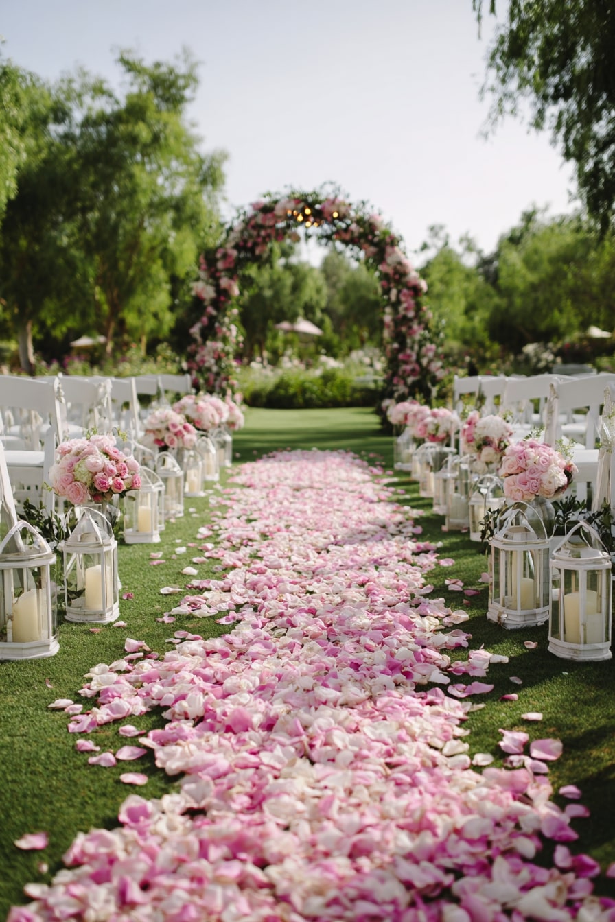
It’s the curve that works. A blush petal path, wide then narrow, leads clean to a floral arch. But it’s not flat. Layers of rose pink and cream petals add movement. It feels soft, like fabric.
Lanterns bring structure. Glass and white metal keep it classic. Paired arrangements repeat the palette without distracting. It’s not just pretty. It’s rhythmic. Directed. Dreamlike.
18. Mix Lilac Glassware with Wild Blooms for Vintage Softness
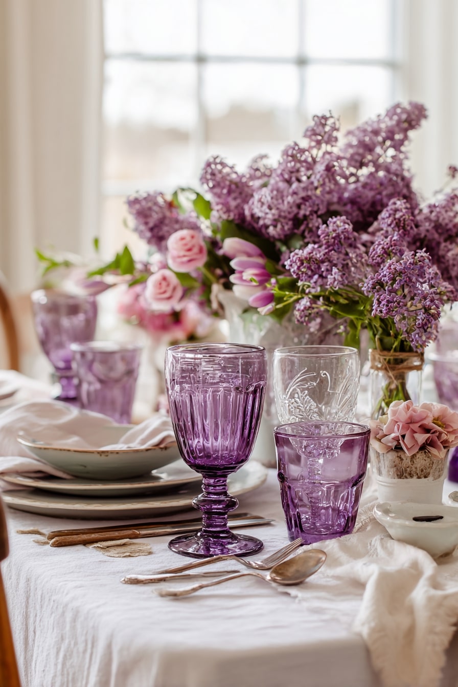
It’s tactile. Pressed glass, heavy in hand, tinted lilac. Not lavender, not plum. Just that mid-tone hue that plays well with pale pinks and faded greens.
Florals lean loose. Tulips, lilacs, garden roses, clustered but not stiff. Napkins puddle. Flatware mismatches slightly. Together, it feels collected, not curated. A pastel table that’s layered, imperfect, lived-in. Romantic, without trying.
19. Vary Necklines in a Single Shade for Soft Cohesion
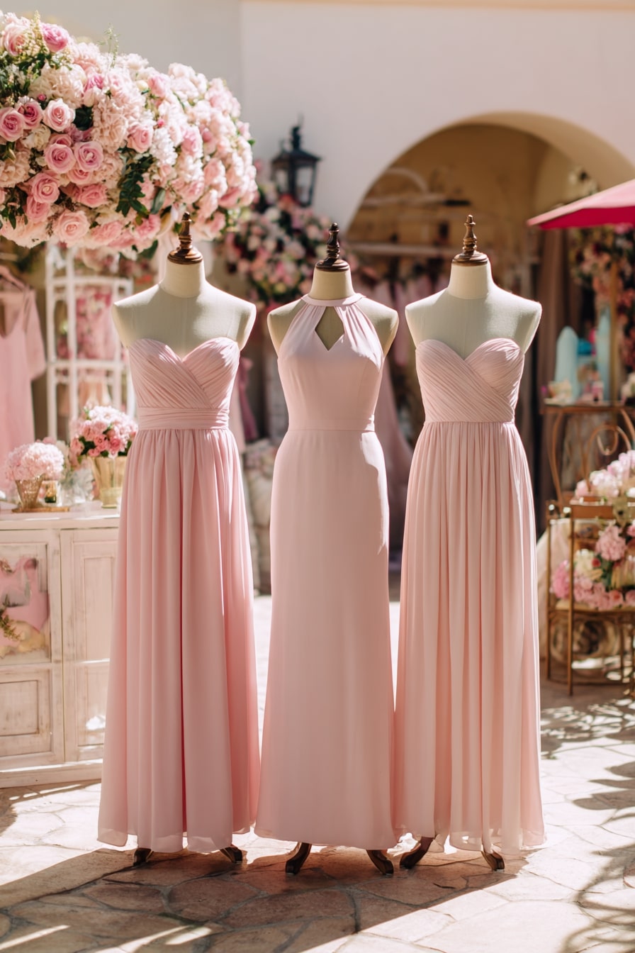
It’s one color, many moods. Blush pink across all dresses, but each cut shifts the tone. Strapless feels romantic. Halter reads sleek. Gentle pleats add texture without bulk. It’s how you keep uniformity from feeling flat.
Backdrop helps too. Roses in every direction, pale and plush. Florals mirror the fabric. Altogether, it’s harmony through subtle contrast. Soft, sculpted, balanced.